But what recently has really been getting my notice isn't the character development and the ability to see some of the defining character moments and first meetings among the crew - it's the art.
Now, John Troutman has had more than a few webcomics. Many of them have been successors or side-strips or prequels or sequels or all manner of interconnected works - but they have each been pretty distinctly different. His art style is constantly changing - in some cases simple improvement, in some cases simply trying out different styles and techniques.
His latest style is much more intensely detailed then his previous works. It's a good style, and works well with moving from pure comedy to a more story driven setting.
The only thing I had found slightly disconcerting was the way he drew the faces - adding in some prominent cheekbones on many of the characters was mildly disorienting. But my uncertainty about the new style was blown out of the water when I saw the latest update - which features our first scene with Andie.
Now, Andie was never really my favorite character in the strip. I mean, I liked her, but she just never pulled me in as well as some of the others.
I think, though, that has now officially changed.

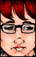
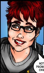
 The image on the left is the one that Troutman has been using to represent the latest update - on the Keenspot newsbox, on his own update page. Its a good image, and its definitely cute.
But it's the image on the right that won me over.
Troutman was able to capture an incredible depth of expression with this new style. I'm not even going to get into the new look for Andie - other than to say that it works, and works well - but just with the face alone, he seems to have caught a moment of real honesty. Real feeling.
That's hard. That's a challenge no matter what style you're using.
I am confident that this is by no means the final stage of his artform. We will see it continue to evolve throughout this work alone, let alone any projects that follow. And that's good - that's a good thing.
But right here, right now, he got it right.
Andie was a prominent character throughout almost all of his previous works. She even had her own entire spin-off. She had, arguably, a more complex background than many of the other characters. Througout all of that, though, I never really got her. Never felt any great attachment.
4 pages. It took him all of 4 pages to change that.
Now that's skill.
No comments:
Post a Comment